Observed
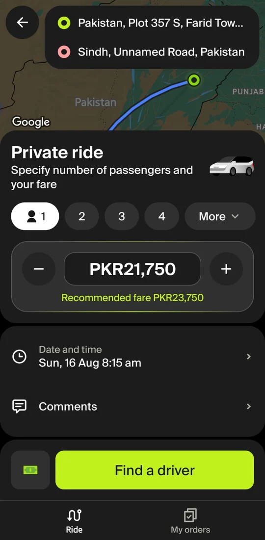
The passenger sees a recommended fare.
It sits right under the price field. Whatever he offers, he offers it against an anchor.
Passenger app
anchor
- The passenger's anchor
Have you ever had an inDrive driver accept your ride, then message asking you to cancel? I used to assume I knew why. Then I started asking, and the answers didn't match. So I spent two weeks beside one new driver, on the app I'd only ever seen from the other side.
Not affiliated with or commissioned by inDrive.
gets a price.
A recommended fare,
before he books.
gets a guess.
+5%, +10%, +15%.
No rate.
No distance.
Real ride from his two weeks
PKR 453
You accepted
You priced 3 rides in 36 seconds without the one number that answers the question.
Your game
PKR 0
Losses you took 0
Rates you knew 0 of 3
Keep reading. You'll get a rematch later.
The study in numbers
I went in expecting a man confused by an interface. He wasn't confused. He had a method.
I wanted the moment before habit: what a new driver runs into before any of it feels normal.
One driver is thin evidence, so I set myself a rule. Every claim on this page carries a label that says exactly where it came from.
Finding 01: The anchor
It sits right under the price field. Whatever he offers, he offers it against an anchor.
Passenger app
+5%, +10% and +15%. None is labelled. None says what the trip is worth. He can't tell a fair offer from a lowball without rebuilding the calculation himself.
Driver app
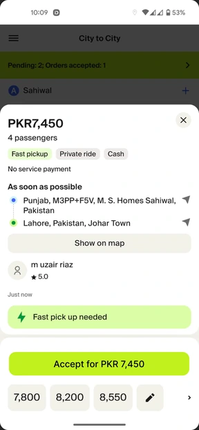
Other drivers see the same offer, so every second spent deciding is a second he might lose it. Not carelessness. The safer move. Then he works it out, finds the answer is no, and asks the passenger to cancel. I saw this from the back seat, repeatedly. The drivers gave this as the reason.
Driver app
Five passengers can't fit in a hatchback. It takes a bigger car: a seven-seater or a large SUV, with more fuel per kilometre and more wear. The same trip should cost more.
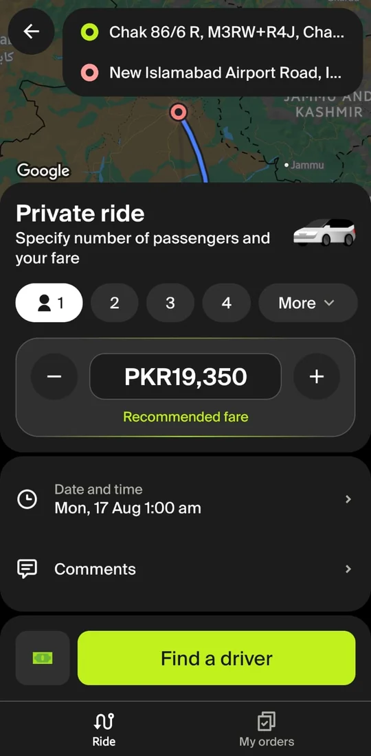
The app recommends PKR 19,350 for one passenger and for five. The driver's card says "5 passengers". The anchor price doesn't know.
Passenger app, 1 vs 5 passengers
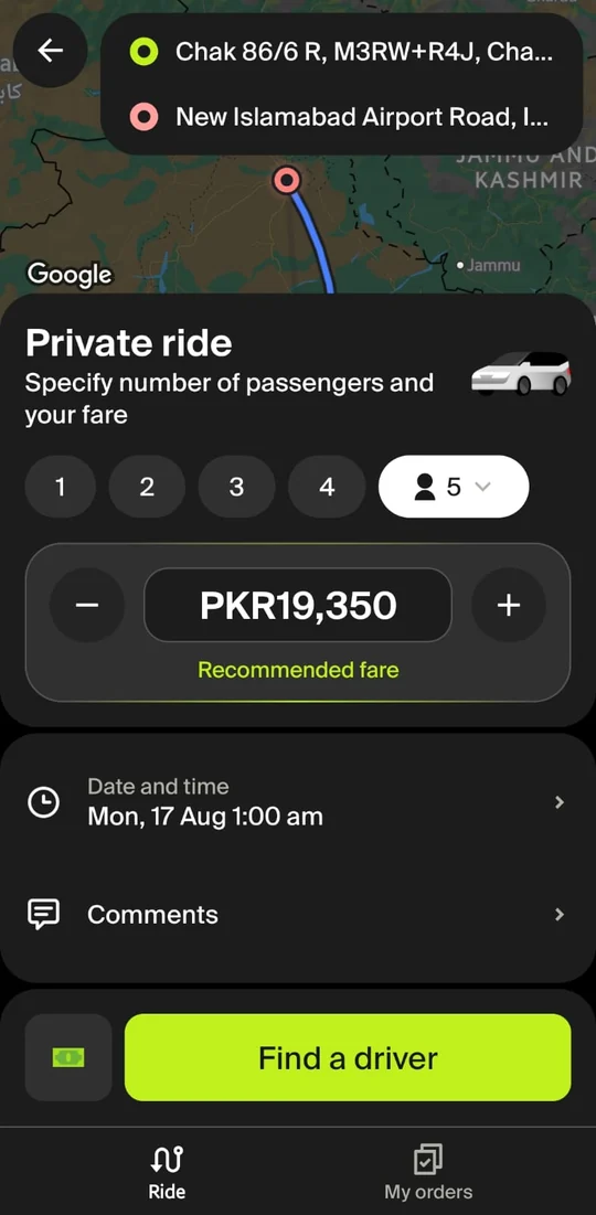
Same fare for one passenger and for five: PKR 19,350
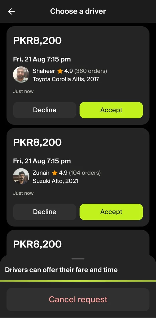
Offers show a model name and a year: "Suzuki Alto, 2023". Models change every year, and most passengers aren't car people. A student, a parent travelling with an older relative, someone heading out of the city with three suitcases: none of them can tell from a name whether they'll fit.
No photo, no seat count, no luggage space. They see the car only after they accept, or they leave the app to search for it.
Passenger app, choose a driver
Finding 02: The distance
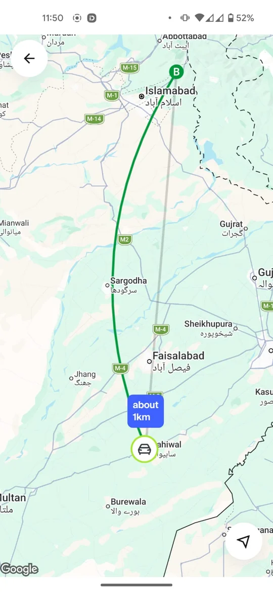
This finding is about city-to-city rides only. In-city, the app shows the trip distance clearly. That's what makes it a gap, not a limit of the product.
The real trip
~350 kmthe city-to-city trip to IslamabadWhat the app shows
1 kmthe drive to the pickupCity-to-city ride
No trip distance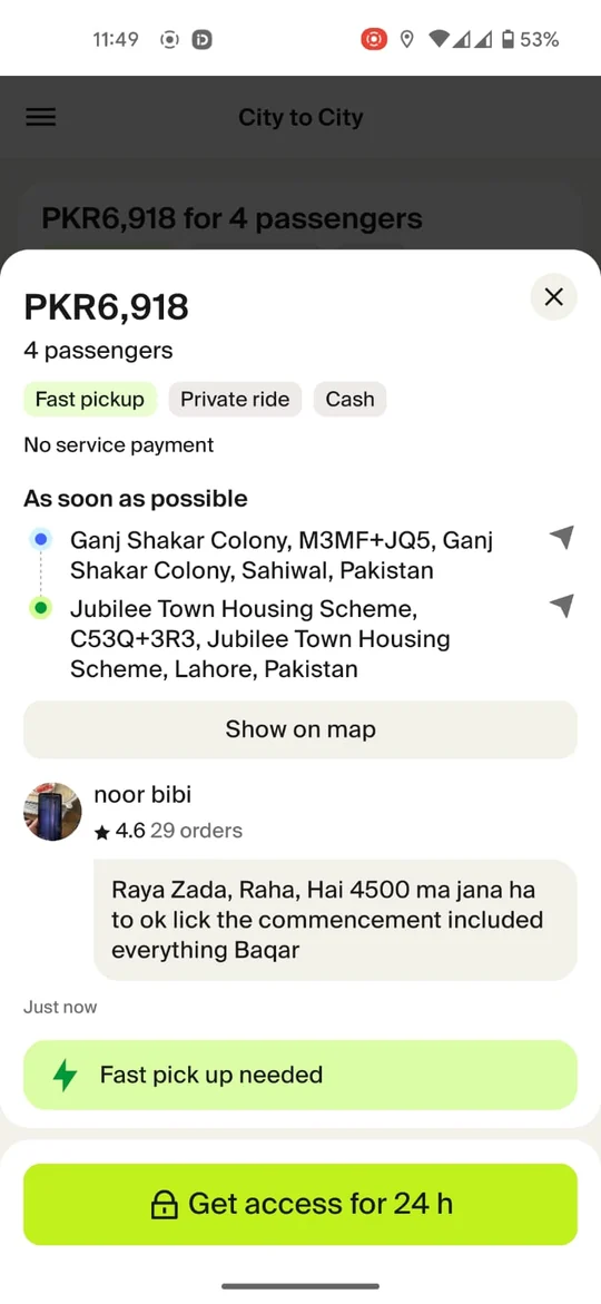
In-city ride
Distance shown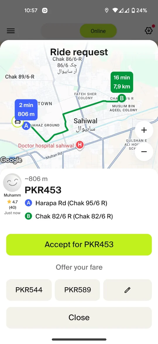
Distance is step one of how he prices every ride.
Switch the tab and watch what happens to his maths without it. His numbers: petrol PKR 325 a litre, 14 km per litre in the city.
Switch the trip
In-city, he has the distance. He can do the maths, if he has time.
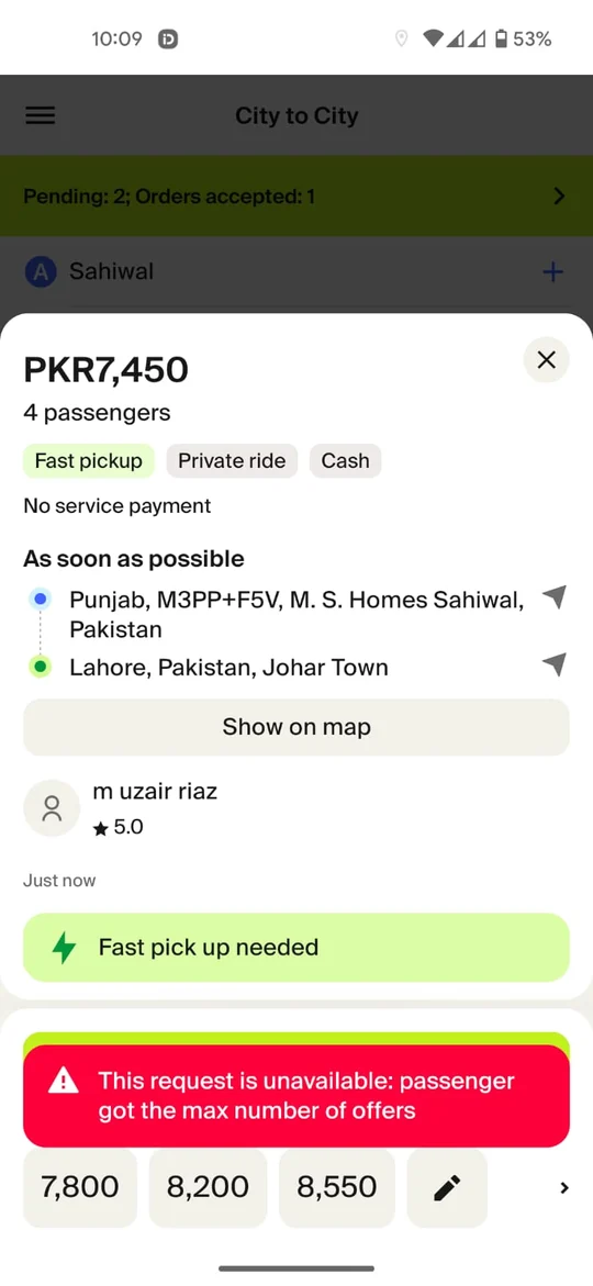
So he leaves the app. And the offer is gone.
He finds the distance somewhere else, runs the numbers, and comes back to a full offer. It isn't a timer. It's a cap on how many drivers can bid.
He is competing on speed for information the app already has.
Finding 03: The answer
The screen solved the data problem. Not the judgment problem.
The pattern
He doesn't need the platform's number. He needs one he can work out himself.
THE SOLUTION
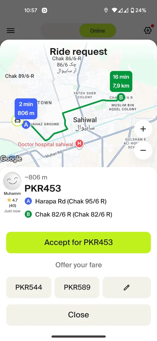
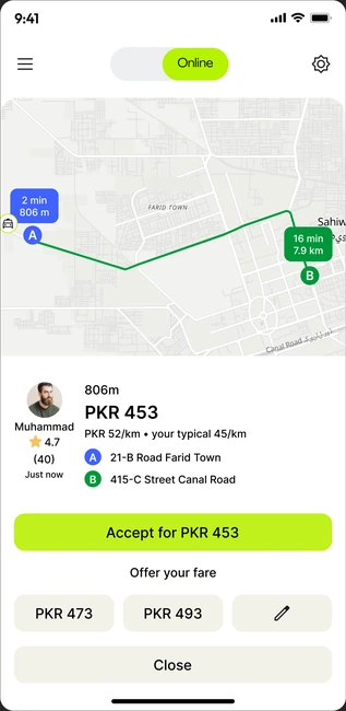
One line of type under the fare. It doesn't make the judgment for him. It clears the arithmetic out of the way, so judgment is what's left.
In-city ride request, the only change
PKR 453
PKR 52/km • your typical 45/km
The fix, in the real screen
Switch between today and the proposal. The new line is the whole fix.
What this ride pays per kilometre, including the drive to pickup.
What he usually earns: the median of his last 7 days. Hidden below 20 rides.
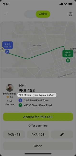
Why this one
His four steps collapse into one comparison: one number against one number.
It compares him to his own typical ride, so the app never claims a ride is good or bad.
Both figures already exist in the product. Shipping it is one line of type.
This time the card does the maths. You see what the ride pays per km next to his usual rate, so you know in a second if it's worth it. No calculator, no leaving the app, no guessing. The call is still yours.
Real ride from his two weeks
PKR 453
PKR 52/km • your typical 45/km
You accepted
First game
Play the first game to compare. Go to the first game
PKR 0
Losses you took 0
Rates you knew 0 of 3
With Rate Check
PKR 0
Losses you took 0
Rates you knew 3 of 3
The stress test
A number on a driver's screen will be trusted, so it had to survive his real rides first. Six of them, at PKR 23.2 a km in fuel.
| Ride | Fare (PKR) | km driven | Rate per km | Fuel | Margin |
|---|---|---|---|---|---|
| Short pickup | 453 | 8.7 | 202 | 251 | |
| Long pickupDeadhead caught3.1 km unpaid to the pickup | 300 | 9.8 | 228 | 72 | |
| Very short hopFlatters short trips2 km, six minutes | 150 | 2.0 | 46 | 104 | |
| Long deadheadDeadhead caught | 300 | 9.0 | 209 | 91 | |
| Same km, better fare | 400 | 9.0 | 209 | 191 | |
| Long trip, short pickup | 800 | 15.3 | 355 | 445 |
fuel floor, PKR 23.2 per km. Anything right of it pays.Lime a good rateRed a weak rate
Held up
Fuel per km is constant, so margin per km is always rate minus 23.2. It reproduces his four steps instead of approximating them.
It catches deadhead: 3.1 km of unpaid pickup turns PKR 300 into 30.6/km and PKR 72 of margin.
Still blind
Two 8 km rides at PKR 400 both read 50/km, but one takes 38 minutes and the other 14: PKR 338 an hour of margin against 918. A 2 km hop reads 75/km for 104 rupees.
That's why the test plan watches more than the rate.
My first benchmark was wrong.
I started with his average for the day. Then I simulated a day: one long, good ride at 70/km, then four normal ones. Step through it and watch what a normal 45/km offer reads as.
Average so farMedianthe 45/km offer
Press "Next ride" to start the day.
Step through his day, one ride at a time.
The decision
One unusual ride, and every normal offer looks bad all day. So the proposal uses a median.
The stress test changed the design.
A benchmark that lies is worse than none. Three things broke it, and each changed the design.
The risk
No more learning good rides by taking bad ones.
What I'd watch: days to Nth ride, first-week earnings
He prices before, not after.
What I'd watch: post-acceptance cancellations
He sees what it bought him.
What I'd watch: repeat purchase rate
The slowest benefit, and the largest.
What I'd watch: 90-day retention
Fewer disputes to handle.
What I'd watch: contacts per ride
The response
I reached out to Dima Sergutov, a senior product design manager at inDrive. We met and went through the study together. He found it really informative, loved the work, and asked me to share the presentation so he could pass it on to his team.
Then I shared the study publicly. The comments were the best part: people tested the idea, not just the visuals.
LinkedIn, about a month after posting
On LinkedIn
Comment on LinkedIn
Really good insight. The app had the data, but not the context needed to make a quick decision. Sometimes good UX isn't about adding more - it's about making the existing information useful at the right moment.
Comment on LinkedIn
Appreciate the efforts you put into this micro case study and the findings as they are providing values from the both business and user side.
My reply
The business side is the part I was most careful about, because a fix that only helps the driver isn't one inDrive would ship.
The sharpest question.
How does the app deal with the scenario where rate for the ride that is available to accept is below the median earnings for majority of the rides? Would that not create a supply problem where drivers are accepting even fewer rides per day?
My reply
This is the right question to ask. It goes straight to the trade-off the whole thing lives or dies on.
On countering
On inDrive, countering isn't refusing. The passenger can accept the counter, and the ride goes ahead. So more counters doesn't mean fewer rides, it means more negotiation, which is what the product is for.
On the median
Half his rides sit below it by definition, so it was never a cutoff. It answers "is this normal for me," not "is this good." Good is the fuel floor, around 23 per km, and nearly everything clears that.
On quotas
I'd push back. That's the platform deciding which rides he takes, and inDrive's premise is the opposite. If acceptance drops on certain routes, that's a signal fares are wrong there.
“This is great!” Moazam Ijaz, UX Design Leader
“Amazing job” Yashfa Zabih, Product Designer @ Dubizzle Group
“Legendary work man!!” Faizan R., Senior Product Designer
“Well done! Appreciate the efforts.” Ali Zain, Software Engineer
Four things this study changed about how I work.
With one driver, the honest move was to tag every claim. It made the thin parts visible, and the strong parts stronger.
Now every claim I make carries its source.
My first idea was a profit score for every ride, built from the mileage drivers enter at sign-up. That number is wrong twice: drivers guess it, and it drifts as the car ages. Rejecting it is why Rate Check uses his own rides instead.
Now I drop ideas that need a guess to work.
The screen looked finished before the maths was. Six rides and one simulated day changed the design more than any layout did.
Now I test the logic before the pixels.
The best fix kept the decision with the driver. It just stopped asking him to do sums in seconds.
Now I design the step before the decision.
inDrive, self-initiated
Shared with inDrive's product design team, and well received on LinkedIn.
Not affiliated with or commissioned by inDrive.
Next, from my case studies
That was a self-initiated study. Here's one of my full case studies.