MindHYVE design system
A multi-brand design system for a team that ships with AI.
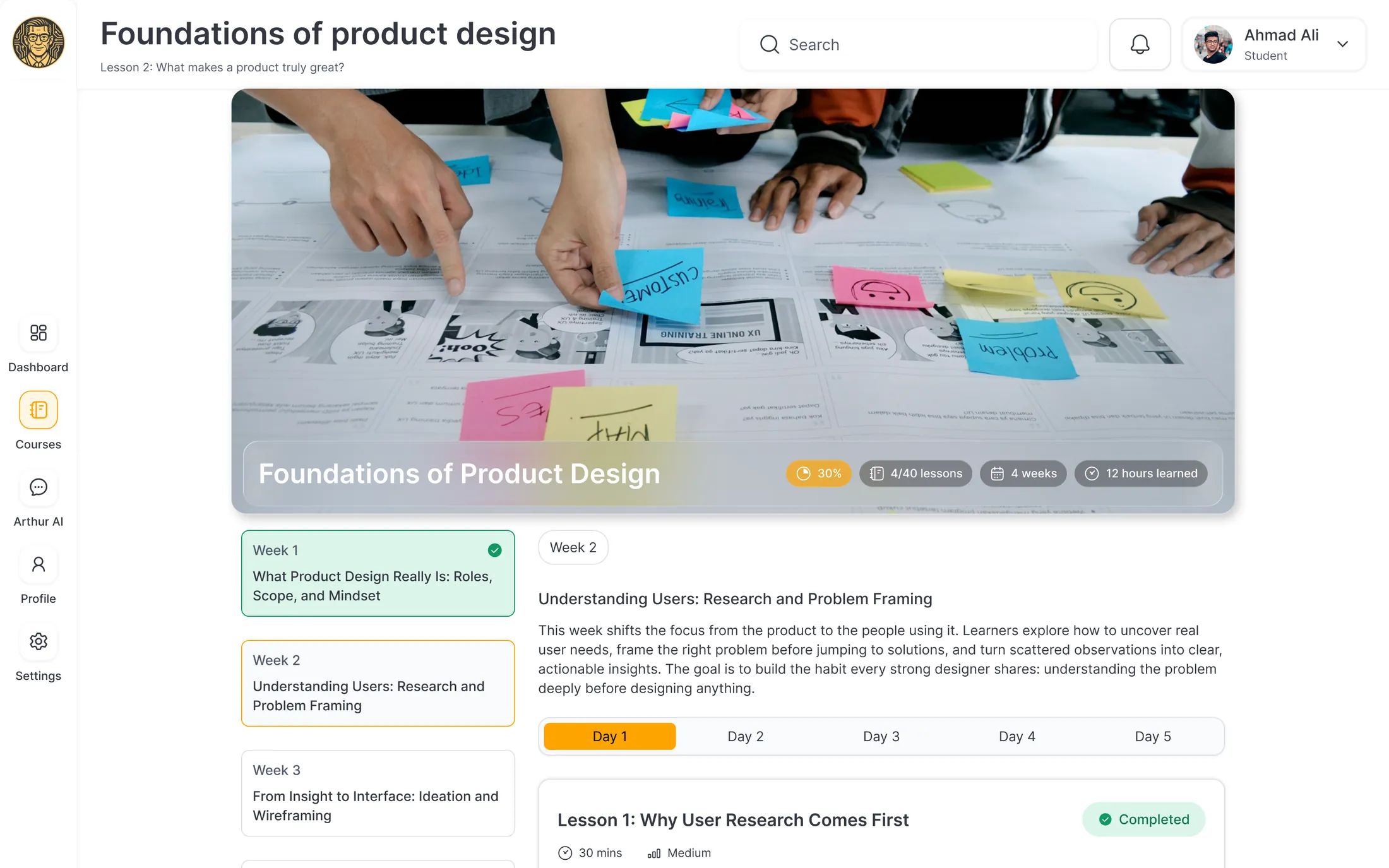
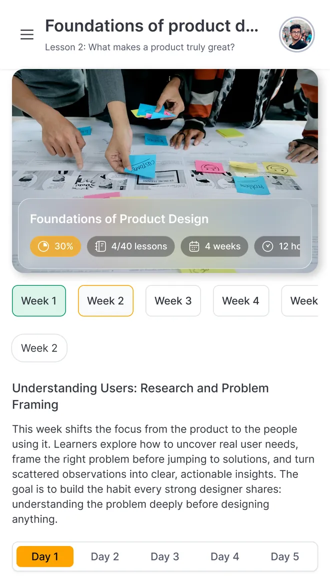
ArthurAI, Inter, Light
The Overview
Three products. Three industries. One foundation.
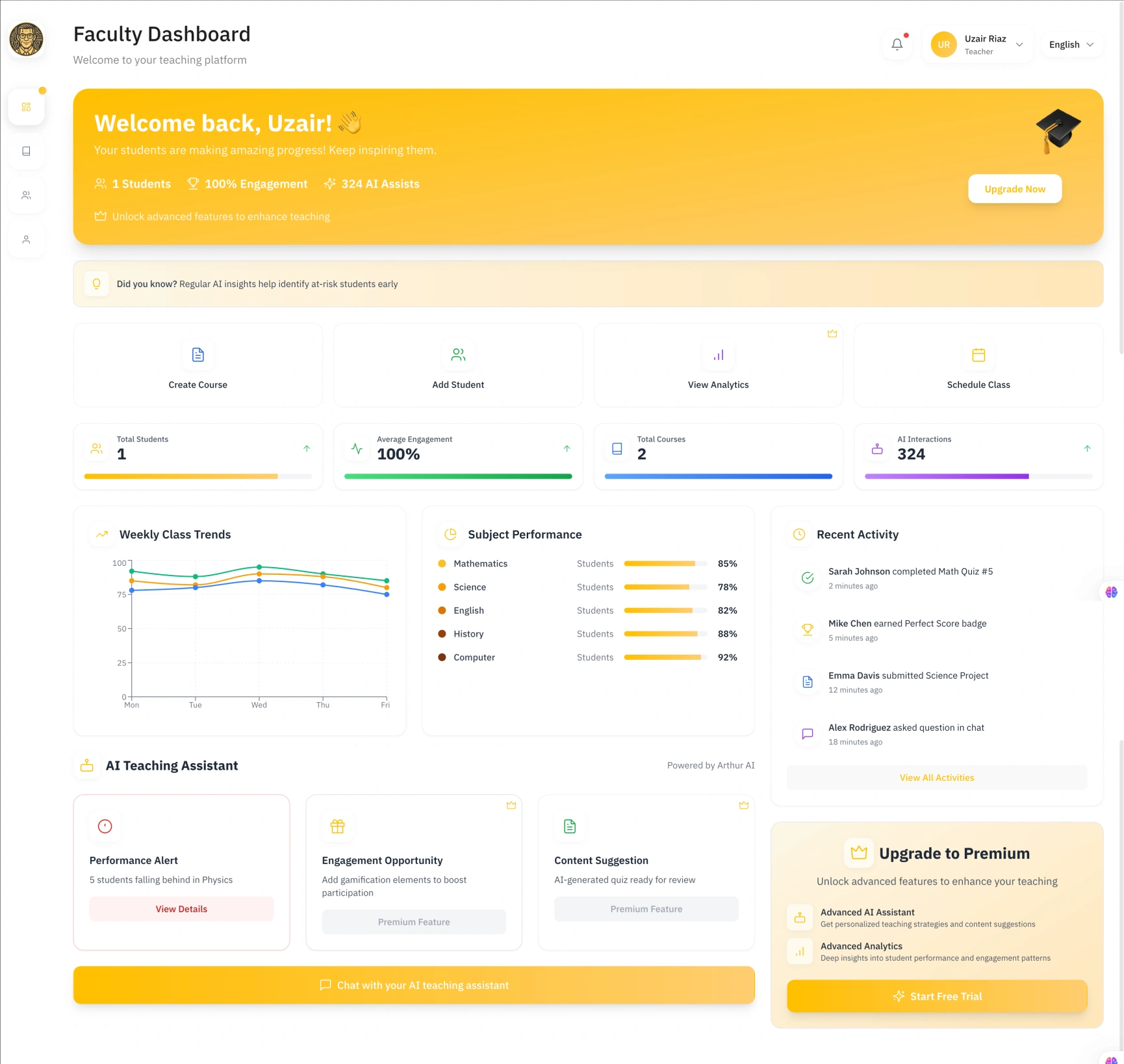
MindHYVE builds three AI products for education, law and healthcare. Its developers were shipping fast with AI tools, and every product was starting to look as if a different company had made it.
I created an AI-first design system to give them one foundation: a brand became a setting rather than a separate library, and a developer could build a new screen without waiting for a designer.
I designed it in Figma, built in code, and handed it to developers ready to use. They built new screens from it.
The problem
The company chose speed. AI delivered it, without a design language.
MindHYVE was a young team with several products to build and two designers. There were two ways to move faster: hire a much larger design team, or let developers design with AI. The company chose AI.
Developers were asked to beat the deadline: build with AI, follow its suggestions, and use their own taste where they could. They shipped fast. They told the AI which colours and fonts to use, but everything else was left to chance.
Every product was moving fast, in a different direction.
Reviewing every screen by hand would never keep up. The fix had to be something developers, and their AI tools, could follow without a designer in the room.
Without a system, every new screen is a design decision someone makes alone.
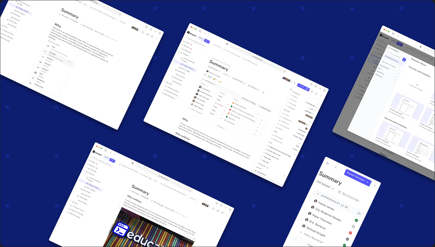
Four bar colours, none from the brand
Cards barely stand out from the page
Six button styles on one screen
- Four bar colours, none from the brand
- Cards barely stand out from the page
- Six button styles on one screen
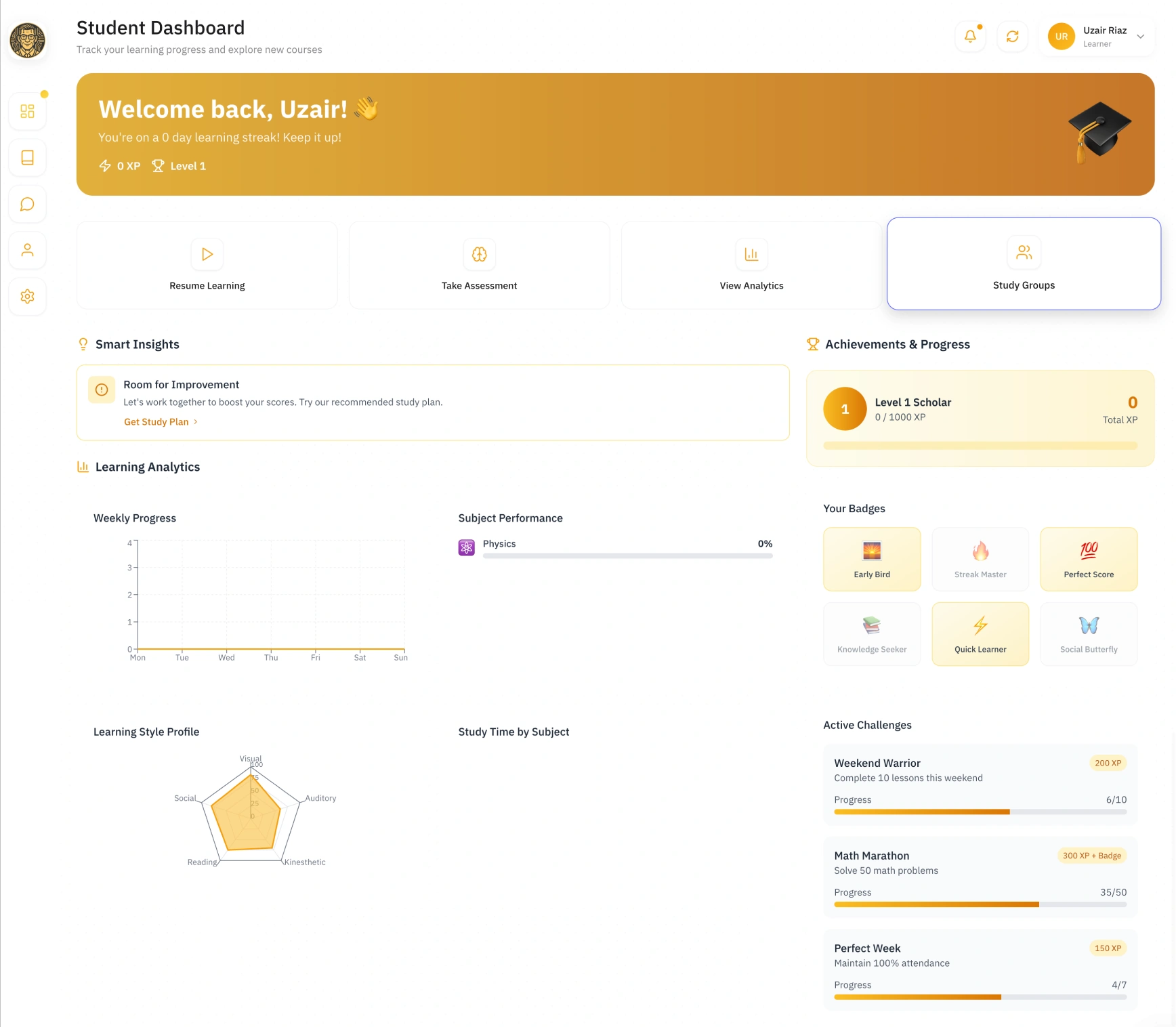
Main action hidden as link
No container differentiation or hierarchy
Purple selected state, outside the brand
Empty graph with no next step or info
- Main action hidden as link
- No container differentiation or hierarchy
- Purple selected state, outside the brand
- Empty graph with no next step or info
Root causes
Colours and fonts were in every prompt. Nothing else was.
I audited the screens flow by flow to understand why they kept drifting. The differences traced back to four gaps:
The AI only knew the brand’s surface. Spacing, sizes, radius and layout were left to the tool, so every screen invented its own.
Nobody checked accessibility. Text and background pairs failed contrast, because nothing in the process measured them.
Every screen reflected whoever built it. Each developer filled the gaps differently, so the same task looked different from screen to screen.
States were improvised. Hover, error, empty and loading weren’t designed, so each was made up in code.
In every prompt
What the AI was told
Foundations
- Colours
- Fonts
Left to chance
What each screen invented
Foundations
- Type scale
- Spacing
- Radius
- Component sizes
- Light & dark
- Icons
Structure
- Layout
- Breakpoints
- Components
States
- Hover
- Error
- Empty
- Loading
The decision
I couldn’t design three products screen by screen. So I designed the recipe instead.
Designing every screen for every product would never keep pace with developers building with AI. So rather than compete with that speed, I gave it rules to follow: a system I could keep improving, handed to developers so every product, however fast it was built, came out consistent.
Don’t design every screen. Design what every screen is made of.
In the design system
Defined once, used everywhere
Foundations
- Colours
- Fonts
- Type scale
- Spacing
- Radius
- Component sizes
- Light & dark
- Icons
- Brands
Structure
- Layout
- Breakpoints
- Components
States
- Hover
- Error
- Empty
- Loading
Left to chance
Nothing
Goals
The goal wasn’t a library. It was to change how the company builds.
For the business
Make consistency the default, not a review step. The right choice should be the easiest one, so screens arrive on-brand without anyone checking them.
Make a new product cheap. Launching a product should mean adding a brand, not building another library.
Fix once, fix everywhere. Every product shares the same atoms, so one improvement lands in all of them.
For the team
Design every context up front. Every component in every state, light and dark, desktop, tablet and mobile, before anyone needs it.
Speak the language of developers and their AI tools. Names and structure that match the code, so people and machines pick the right part.
Close the gap between design and code. Developers receive working parts and build new screens without waiting for a designer.
Research before pixels
I didn’t start in Figma. I started by asking what the system had to survive.
A system for one product can be a style guide. A system for three brands, built partly by AI tools, needs an architecture. So before designing anything, I studied how mature systems handle more than one brand, and chose a starting point that wouldn’t box us in.
Choosing a starting point
I looked at the established systems first, Material Design and Ant Design, along with several popular Figma UI kits. Each had its strengths, but the big systems bring their owners’ look and way of working, and we needed something three brands could make their own.
Beyond UI 2 stood out as the most modern and complete kit I found. Just as important, it fitted how our developers worked: they built on shadcn/ui, whose components live in the codebase and take their look from CSS variables. The AI tools the team used produce that same stack by default, so the design and the generated code could speak the same language.
I treated it as a foundation, not a finished system: the brand theming, light and dark modes, breakpoints and states were built on top for three products.
DESIGN SYSTEM
Material Design
Google’s design language. Proven, but hard to make feel like your own brand.
DESIGN SYSTEM
Ant Design
Built for dense enterprise admin tools. A heavy look to re-brand three times.
FIGMA UI KIT
Other UI kits
Useful pieces, but less modern and complete than the kit I chose.
FIGMA UI KIT
Beyond UI 2
Modern, complete, and aligned with the code we ship: shadcn/ui.
Chosen
Studying how systems scale
I studied atomic design and other ways of structuring components, then went deep on tokens: how a raw value becomes a primitive, how a primitive becomes a meaning, and how one set of meanings can carry several brands, each with its own colours and fonts. It’s the hardest part of a multi-brand system to get right, and everything after it depends on it.
Build from atoms up
Small parts combine into bigger ones, so nothing is designed twice.
- #FDA400VALUEprimary-defaultMEANING
Components ask for the meaning, never the value.
Separate a value from its meaning
A colour is stored once. Components ask for what it means, not its hex.
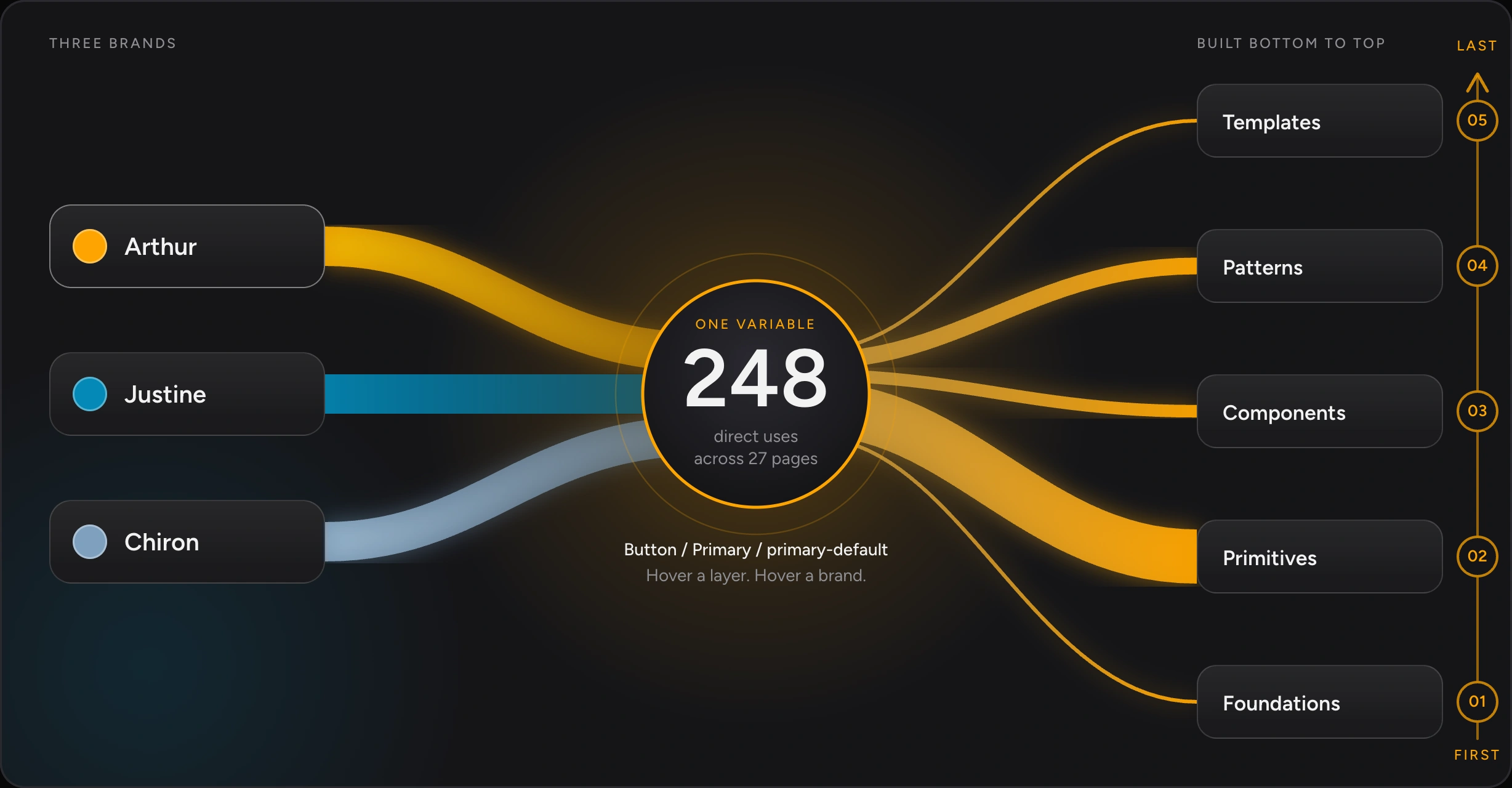
- primary-defaultArthurJustineChiron
Make a brand a layer, not a copy
One set of meanings, with every brand sitting on top of it.
Naming for people and machines
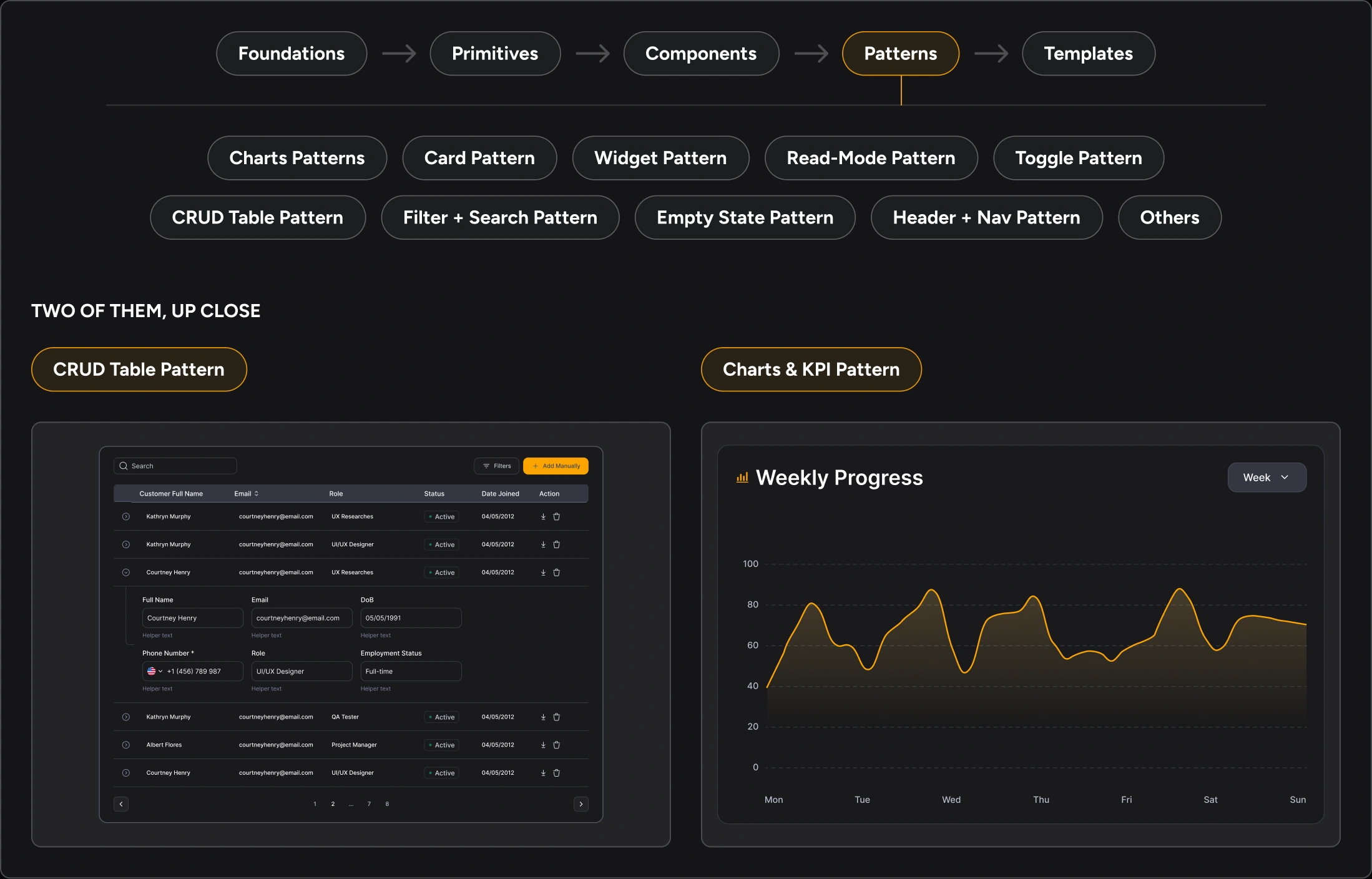
Developers, and the AI tools they used, find things by name. So the file is numbered in build order, and every pattern is named by its job, not its look: CRUD Table Pattern, Form Layout Pattern, Filter + Search Pattern.
The architecture
Five layers, each with one rule.
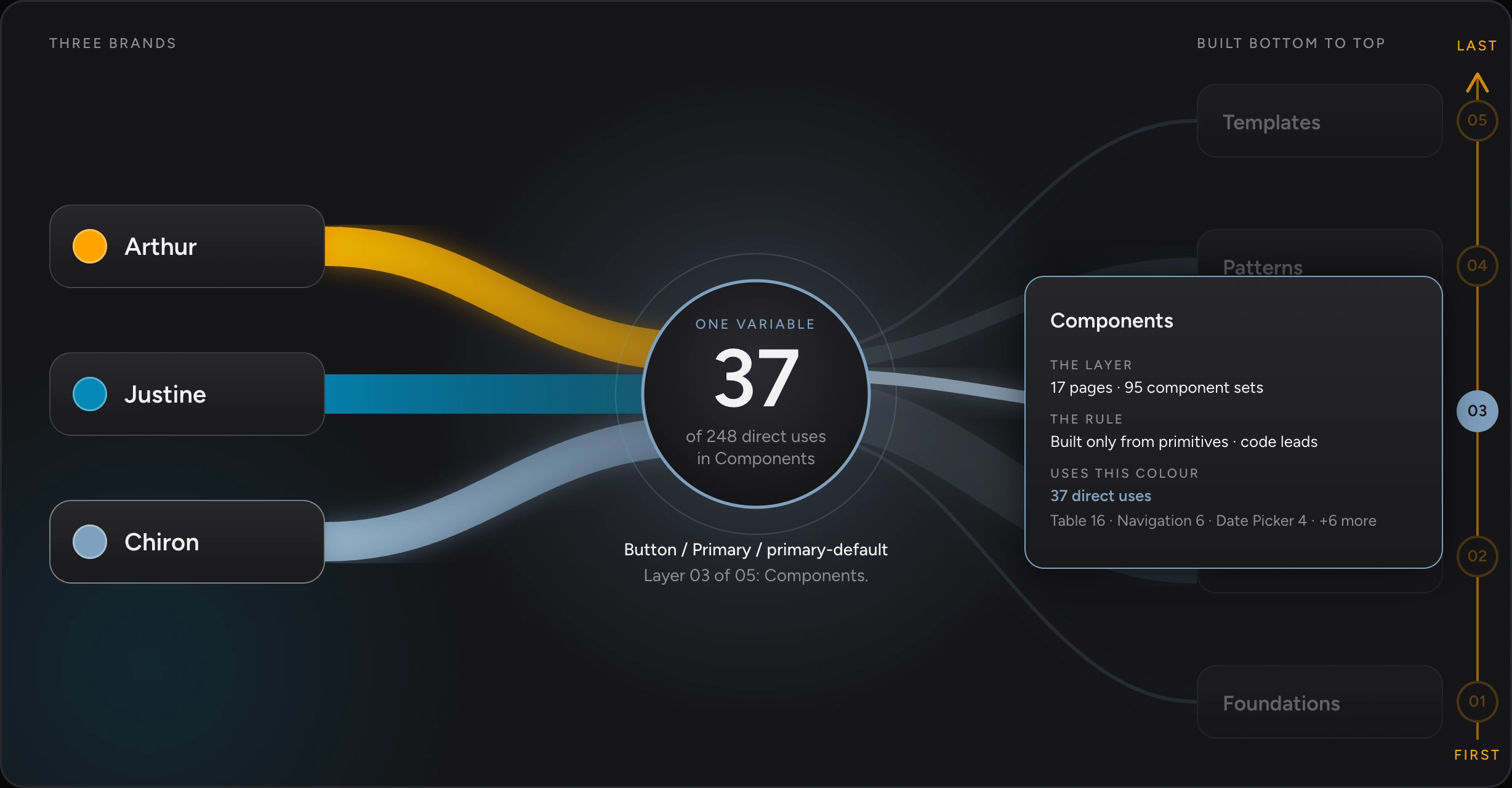
The layers are common. The rules are what make this system hold. Each layer says what it may contain, and whether design or code leads, so nobody, human or AI, has to guess.
Arthur AI lives at the top, in Templates. A product can use the system; it can’t change it.
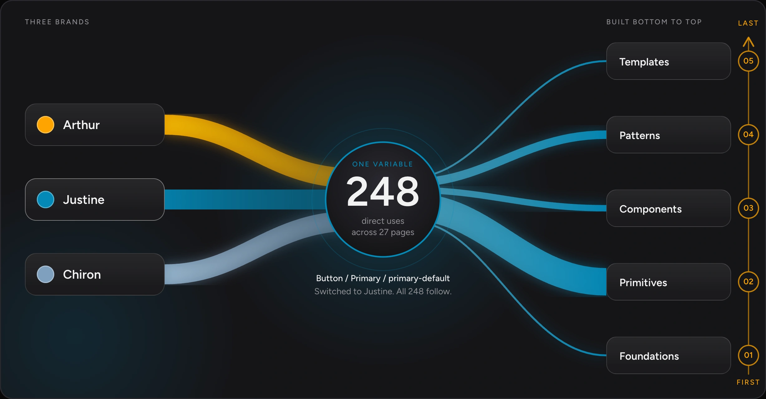
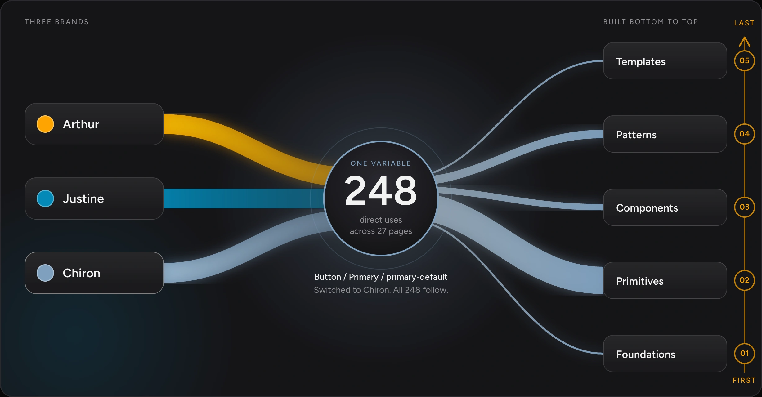
Every value has a path. A button asks for a meaning, the meaning points to a brand colour, and the brand colour points to a raw value. That one colour is used in 248 places across 27 pages, and switching the brand moves every one of them. Layout and shadows switch the same way. In all, 654 variables in five collections do this work.
Foundations
Everything above inherits from here, so it had to be right first.
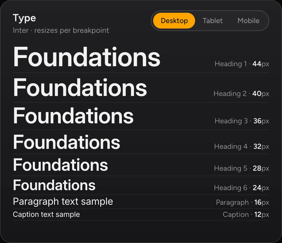
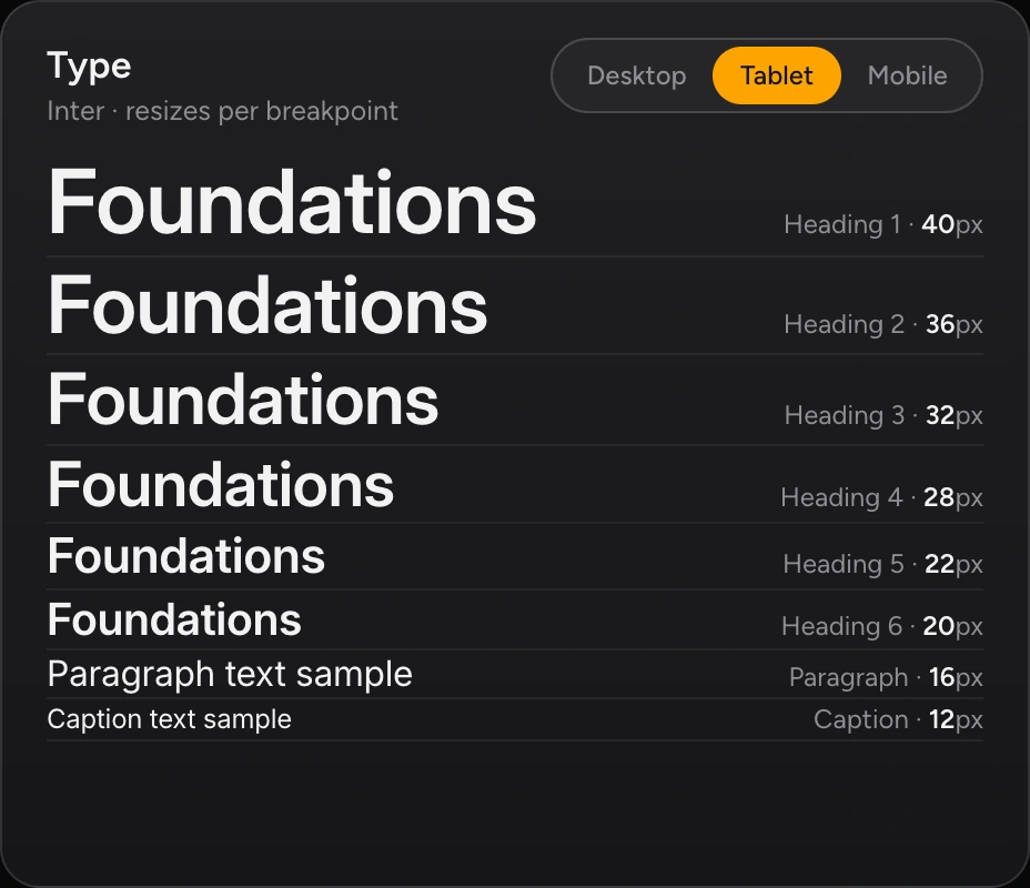
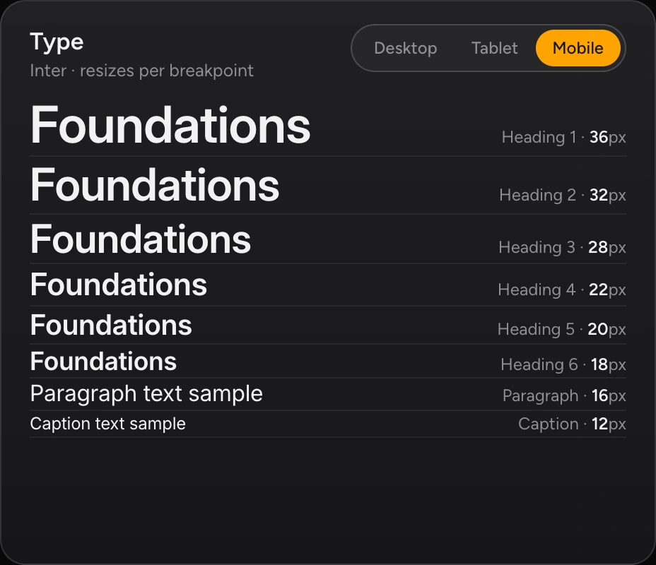
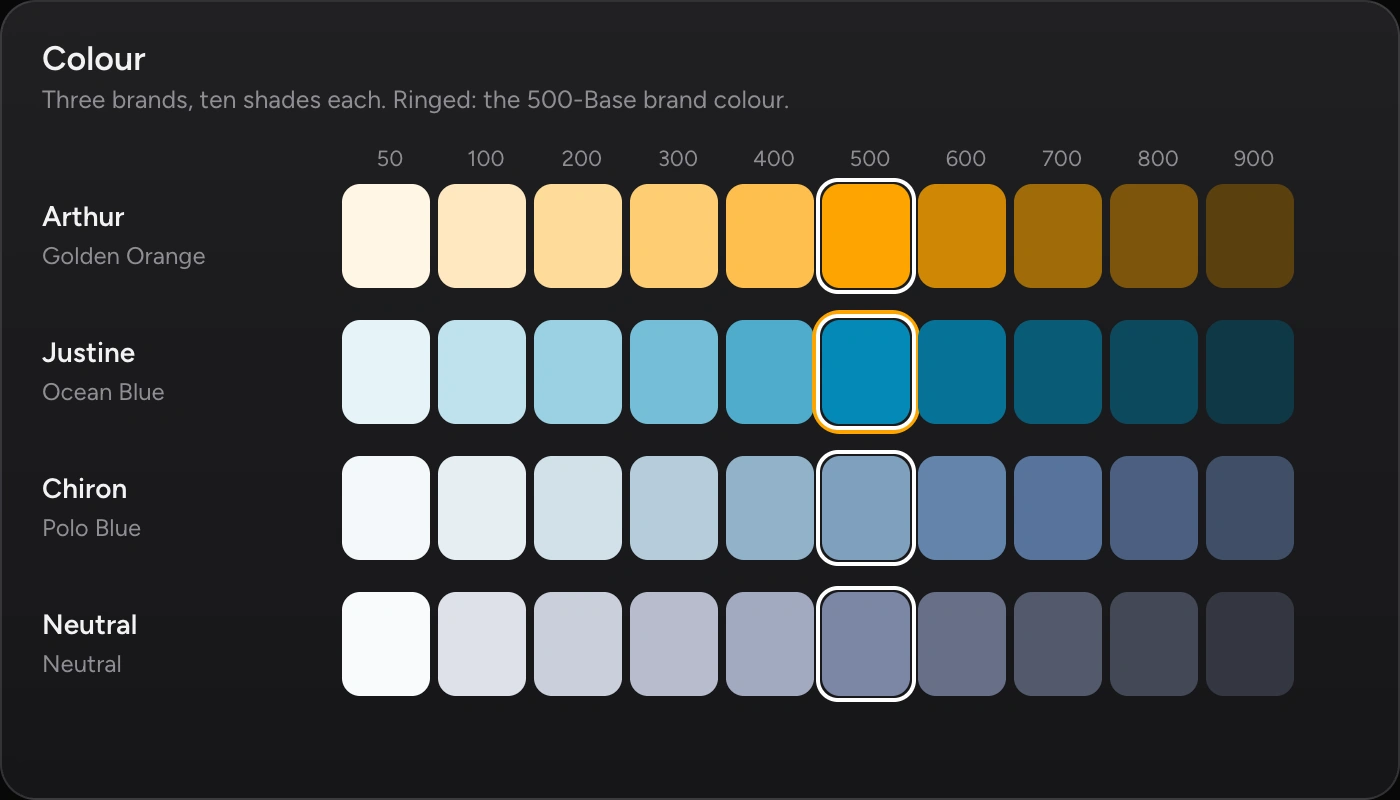
Colour ramps for each brand, a type scale that resizes per breakpoint, spacing on a fixed scale, and radius and shadows as variables. A developer never types a hex value; they pick a meaning.
In the design system, text on the brand-coloured fills is near-black, set by a single variable.

Primitives to patterns
Developers build the states you forget to design. So I designed all of them.
Each level is built only from the one below it. A button knows nothing about a dashboard; a dashboard is only buttons, cards and charts arranged by rules.

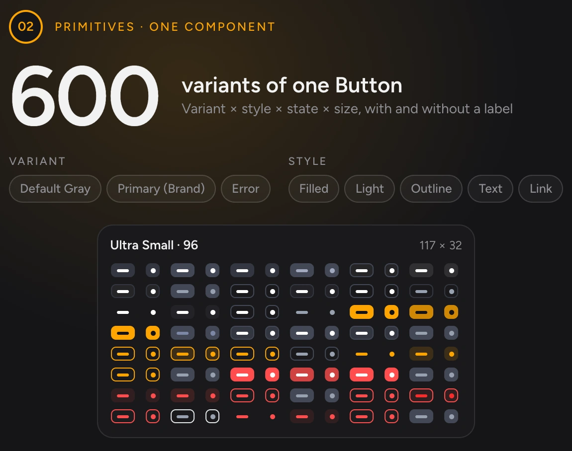
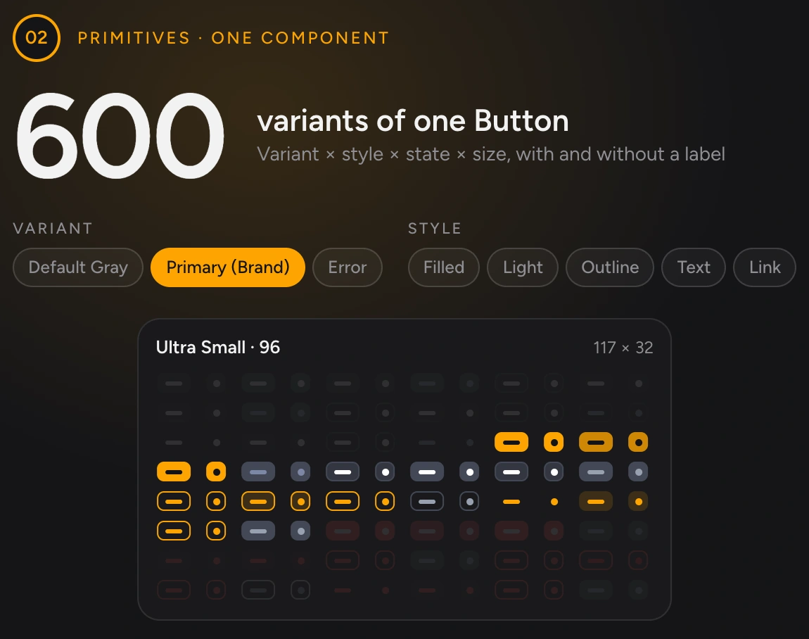
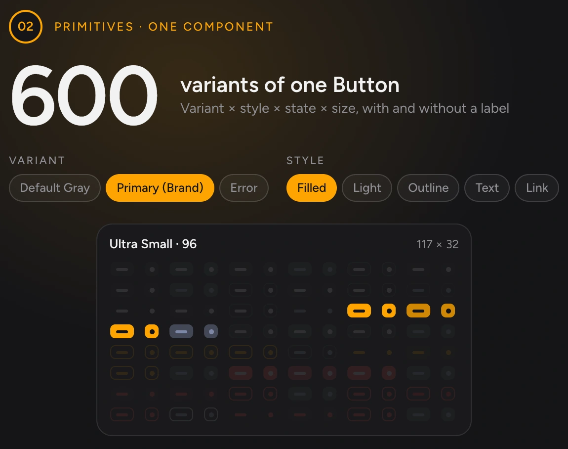
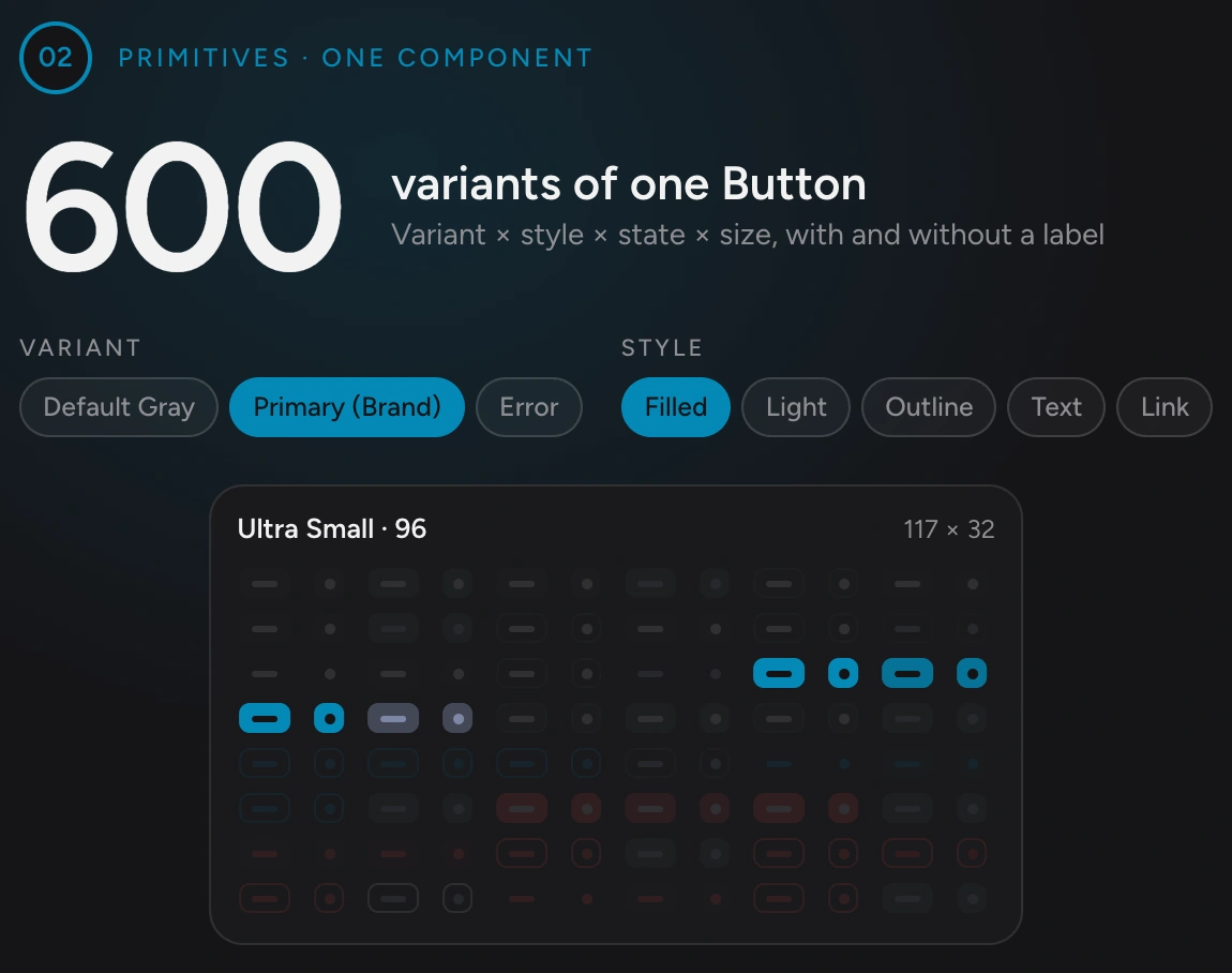
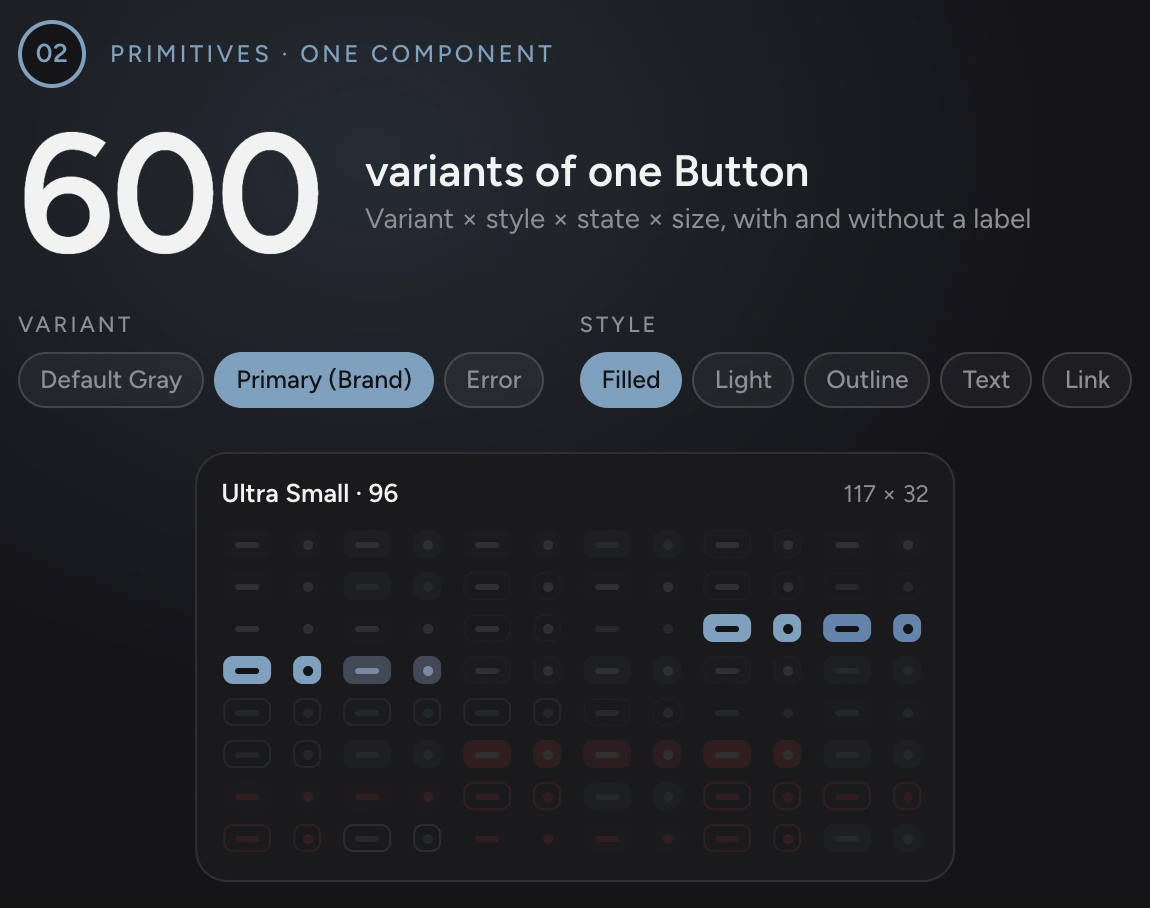
152 component sets. 2,653 variants. Each one a question a developer didn’t have to ask.
One click
One screen. Three brands, two modes, three sizes. No redesign.
This is what the architecture buys. Because every colour, font, shadow and spacing value is a variable, changing a product’s whole look is one setting, not a week of rework. Even layout is a variable: whether the side nav shows, and how wide it is, changes with the breakpoint.
The proof: Arthur AI
A system is only proven when a real product is built from it.
ArthurAI, the learning product, was the first test. I redesigned its student experience entirely on the system: dashboard, courses, the reading experience, the AI tutor, profile and settings. If a screen needed something the system didn’t have, the system changed, not the screen.
Handing over working code
I didn’t hand developers pictures. I handed them parts that already worked.
The gap between a Figma file and a codebase is where design systems usually die. So I closed it myself. In Cursor, I rebuilt the system as React and TypeScript components, then built working screens alongside them. Developers could take that code, connect their own database, and keep building new screens on top, without redrawing anything.
They received the components, the screens built from them, a clickable prototype, and guides for tokens, testing and usage.
Quality
Before handing it over, I asked AI to find what was wrong with it.
I wrote evaluation prompts and had Cursor audit the whole library: architecture, naming, token use, type safety, accessibility and tests. It flagged one area far behind the rest: testing. Few automatic checks existed, so a developer couldn’t change a component and know nothing had broken.
So the next version answered the audit. I added 67 tests across the core components, moved 11 components onto the central tokens, and added linting and formatting rules, before anything reached a developer.
The AI built fast. I made sure it was right.
An AI audit of the component library, in three steps. Audit: Cursor checked ten areas against prompts I wrote: reusability, documentation, performance, architecture, maintainability, security, TypeScript, accessibility, consistency and testing. Finding: testing was the weakest area. Fix: found by the audit and fixed before handover: 67 tests written across the core components, 11 components moved onto the central tokens, and lint and format rules added.

Outcome
Three products now start from the same first atom.
MindHYVE didn’t have to choose between speed and consistency. Developers kept building with AI. What changed is where they started: from the system, not from a blank prompt. Education, law and healthcare now share one design language, and a new product is a new brand mode, not a new library.
Consistency
Before: The AI only knew colours and fonts, so every screen invented its own spacing, sizes and layout.
After: Layer rules decide what can exist. Screens can’t add their own tokens, components or variants.
New product
Before: A new product meant building another library, and another look.
After: A new product is a new brand mode: one column of 123 values on one theme collection.
Fixes
Before: An improvement had to be repeated in every product.
After: The three products share one foundation. One variable change updates 248 places across 27 pages.
New screens
Before: Developers started from a blank AI prompt, and waited for a designer to review.
After: They start from the system: 152 component sets, and build without waiting for a designer.
Handover
Before: Design reached developers as a Figma file to interpret.
After: It reaches them as a React and TypeScript package, with the same names as Figma.
One decision now does the work of many.
One colour variable updates 248 places across 27 pages. One Button holds 600 variants. A new brand is a single column of 123 values. All of it, from first variable to handover, took 2.5 months, with me as owner of the design system and 5 to 6 developers building on it.
ONE SYSTEM
3
AI products on one system
ONE FILE
18 versions
of every screen: 3 brands × 2 modes × 3 sizes
VARIABLES
654
variables in five collections
COMPONENTS
152 sets
2,653 variants
+148 more component sets
TESTS
67
67 tests written
IN USE
5 to 6
developers building new screens from the package
The six goals, answered
Consistency by default: Layer rules decide what may exist, so product screens can’t add tokens, components or variants.
A new product is cheap: It’s a new brand mode. Arthur, Justine and Chiron run on one theme collection.
Fix once, fix everywhere: The three products share the same foundations and components, so one change lands in all of them.
Every context designed: Light and dark, desktop, tablet and mobile, all driven by 654 variables.
Developers’ and AI’s language: Semantic names, and code whose options mirror the Figma ones.
Design and code gap closed: A code package handed over, and 5 to 6 developers built new screens from it.
Developers kept their speed. They just stopped starting from nothing.
What I learned
For a team that builds with AI, a design system is its rules, its handover and its checks, more than its components.
Rules Beat Components
A library shows people what exists. Rules tell them, and their AI tools, what not to invent. The layer rules did more for consistency than any single component.
Design For Machines Too
Developers and their AI tools find parts by name. Semantic names and one rule per layer made the right choice the easy choice, for people and models alike.
Own The Handover
A Figma file is a description; working code is a decision already made. Building the first version myself removed the guesswork between design and development.
Verify, Don’t Trust
The AI’s notes called testing complete, but run from a clean install, the tests wouldn’t start. Nothing counts as done until the build, tests and linter have run.
Next Project
Editor Experience: Finding Solutions for Productivity & Teams Collaboration